
-
Members of the previous forum can retrieve their temporary password here, (login and check your PM).
You are using an out of date browser. It may not display this or other websites correctly.
You should upgrade or use an alternative browser.
You should upgrade or use an alternative browser.
Art Bin
- Thread starter SpireCatalyst
- Start date
Migrated topic.
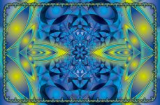
spinCycle said:d-T-r - Really nice form, but I just can't get past the fact that it looks so washed out and overexposed (as in photography) to me. The details get sort of lost in there. Personally I would adjust the levels to bring up some of the dark end of the colors and tone down the white. I think it will bring out the details a lot if it doesn't look so washed out. If you are using photoshop try moving the middle and left slider in the Levels tool a bit to the right to see what I mean. You can do this on all colors at once on the RGB channel or chose each color one at a time to be more selective. You could also try adjusting the contrast.
If that's the look your deliberately going for though, then ignore me.")
haha it was kind of the look i was deliberately going for
 but i also do agree that there are some more details on a darker /colourized version. Ideally i'll be animating it (more like a moving painting as apposed to animation) so the colour scheme and light levels will gradually change. still not finished with it yet anyway, got a few ideas i'm working with to add to it.
 Awesome new work everyone too. nice seeing everyones ideas continually evolve through out the course of this entire thread.
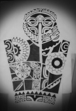
nice ink olympus-mon. Need to get my hands in to more tattoo design.
Pup Tentacle
lettuce
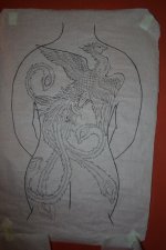
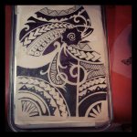
Oly - I love that back tat idea. Would look phenomenal in shades of red and orange.
Oly, great to see you cranking them out! Very striking stuff. I love the patterning that different cultures incorporate into abstract tattoo design. The Phoenix is a beautiful layout... Would be amazing to see it get the kind of color treatment that you gave Ant's head.
Beautiful indeed, Mon. Nice to see you gracing us with your artistic presence.
Have you been tattooing all the Peruvians?
Have you been tattooing all the Peruvians?
Thanks guy's,
Guy-We agree the Phoenix back piece is for Clair and will be in full color. Her Mum is gonna hate me, lol!
Art= I either tattoo travelers or the other tattooers out here. Not too many pervuian locals because of how I get my business of from the internet and most locals don't think to search out shops on line they just go the their "cousins" cousins friend who has a shop, lol
This week is dead for me so Im trying to get a drawing a day inked but my brush pens are dead. I may only get one more out of them and I have been to every art store in there city to replace them.
Attachments

Attachments
Pup Tentacle
lettuce

Mr.Peabody
Rising Star
DAAAAAANNNNG!!
Pup Tentacle, Olympus Mon, and cyb! You guys just turned my brain into shit.
In a good way!:thumb_up:
I feel like a slacker! I've been addicted to my new drawing tablet, but have yet to make anything worth showing......It's coming along, though.
That one is probably my favorite so far, spin!
Pup Tentacle, Olympus Mon, and cyb! You guys just turned my brain into shit.
In a good way!:thumb_up:
I feel like a slacker! I've been addicted to my new drawing tablet, but have yet to make anything worth showing......It's coming along, though.
That one is probably my favorite so far, spin!
Damn!!! Spincycle thats awesome!
not exactly art, but... at least self-made from (almost) scratch
The three symbols on the front cover on the left tell a story... you first have the plant, then you do the extraction and finally you have the alchemical symbol for precipitation... and you get dmt
The three symbols on the front cover on the left tell a story... you first have the plant, then you do the extraction and finally you have the alchemical symbol for precipitation... and you get dmt
Attachments
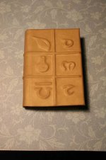
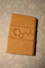
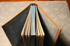
blank - so yes, a journal.
So much cool stuff in the last couple days! Enoon, that's great- I can imagine how it would feel in the hands. You keeping that as a trip diary?
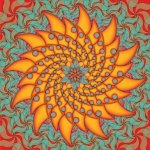
Spin- amazing... Really dig the patterns within the patterns. Definitely avatar-worthy. Your style certainly fits your name!
Pup- super sharp... Curious to know what kind of bands deserved flier art this cool?
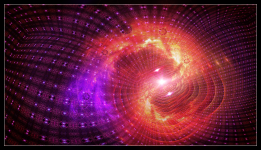
Cyb- I'm a big fan of forced exaggerated perspective, and what a cool way to achieve that in an open space image.
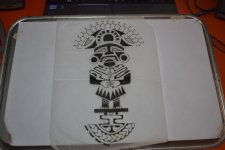
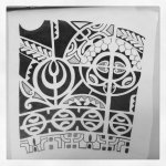
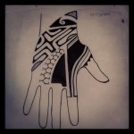
Oly- love the island patterns, and your sense of layout is impeccable. The hand is my favorite. I can't help but imagine these same patterns hovering over the skin like rainbow glyphs...
Spin- amazing... Really dig the patterns within the patterns. Definitely avatar-worthy. Your style certainly fits your name!
Pup- super sharp... Curious to know what kind of bands deserved flier art this cool?
Cyb- I'm a big fan of forced exaggerated perspective, and what a cool way to achieve that in an open space image.
Oly- love the island patterns, and your sense of layout is impeccable. The hand is my favorite. I can't help but imagine these same patterns hovering over the skin like rainbow glyphs...
no, I have a different one with a self-made felt cover that I use as a diary for all kinds of stuff. I just did this one for fun. there's more to come.
Damn staright. There is some serious talent here. Cyb your stuff blows my mind. Enoon ...Im a sucker for hand made binding.Guyomech said:So much cool stuff in the last couple days! Enoon, that's great- I can imagine how it would feel in the hands. You keeping that as a trip diary?
Spin- amazing... Really dig the patterns within the patterns. Definitely avatar-worthy. Your style certainly fits your name!
Pup- super sharp... Curious to know what kind of bands deserved flier art this cool?
Cyb- I'm a big fan of forced exaggerated perspective, and what a cool way to achieve that in an open space image.
Oly- love the island patterns, and your sense of layout is impeccable. The hand is my favorite. I can't help but imagine these same patterns hovering over the skin like rainbow glyphs...
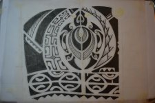
Thanks Guyomech,
Currently Im working on this project between drawings. So Polynesian islanders, and other groups like the Hopi Indians I pull from have set of motifs and symbols they use to represent and adorn. What I'm trying to do is create my own series of motifs and glyphs inspired by tryptamines and then use those. I want my black work to go Scifi/psychedelia. Creating a style is fun but harder than i thought. My hand just keeps wanting to draw what my eyes have seen, lol.
Similar threads
- Replies
- 11
- Views
- 452
- Replies
- 14
- Views
- 674