Updated the stone sizes in my prev post.. And the uncompressed package link is right above the images..

-
Members of the previous forum can retrieve their temporary password here, (login and check your PM).
You are using an out of date browser. It may not display this or other websites correctly.
You should upgrade or use an alternative browser.
You should upgrade or use an alternative browser.
DMT symbol project (work in progress)
- Thread starter daedaloops
- Start date
Migrated topic.
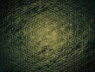
Onethousandk suggested sandstone; Dante brought up the idea of a blurred geometric pattern. So this is my attempt to bring together the best of both worlds.
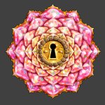
Next, here is my tweaked version of the mandala, with lots of 2 pixel brushwork in there.
Daedaloops: why don't you go ahead and do the honors. Click it all together.
I think the key will need a glow around it. Simply using the glow effect in the Layers palette would work but it might be cool to come up with something that gets stronger closer to the keyhole- maybe even bring in some kind of cool lens flare effect behind the business end of the key. The brightest part of the glow should be pretty close to the keyhole- not enough to cover any of the glyphs, but maybe the glow should start to lighten the closest glyphs, just to give a sense of the key being in the foreground.
The background: whatever you want to do with it. If you want me to provide you the unblurred version let me know. This color is sort of arbitrary and doesn't look quite like sandstone. It might also need to be lower contrast to make it less distracting- see how it looks with everything in place. Maybe add some stars, cosmic action? A glow behind the mandala might be nice, but again, not a simple wraparound glow (you could use a circular marequee with the feather set on 100, on a layer behind the mandala, for instance).
Once all is said and done, we may want to do some very final tweaking here and there, playing with glare effects, etc... but I believe we pretty much have the raw materials to finish. Oh, and you were going to play around with the gold border a bit.
You may also want to post a vwersion with just a plain black background.
Anyway:
Attachments
Parshvik Chintan
Esteemed member
this is incredible!! keep up the good work you guys :thumb_up:
onethousandk
Rising Star
Looks awesome guys! Those jewels look incredible. The whole thing looks incredible.
Guyomech, that background is crazy close to what I had in my head. If I may be so bold as to offer a final suggestion: I would just make sure that the background mimics the color/texture/feel (even if darkened/blurred/less detail) of the sandstone that's currently around the face to make sure the background and flower feel aesthetically connected.
Guyomech, that background is crazy close to what I had in my head. If I may be so bold as to offer a final suggestion: I would just make sure that the background mimics the color/texture/feel (even if darkened/blurred/less detail) of the sandstone that's currently around the face to make sure the background and flower feel aesthetically connected.
Those cubes inside "the molecule" look very nice, I would like to see more of more complex colorful figures in the desings, something that can remind one of those alien logos or "code" some of us see when using DMT. Those thousand petaled lotuses or flower like mandalas have been connected to chakras and supernatural/spiritual for ages but in my opinion or experience they are too simple to be connected to DMT, but they look nice. I like especially the keyhole design which reminds me of two journeys.
Yeah, I hear you. It's hard to express that vibe graphically... This project had really been an exercise in simplification. Meanwhile, I'm working on a painting layout that is at the far opposite end from simple. I really, really want to paint that hyperspace stuff. Way easier said than done though...
You can start by trying to remember the colors. There seems to be some hyperspace color combinations that make up the whole trip for me, something like a formula. One hyperspace color combination in my experiences is yellow, green, purple and red.Guyomech said:Yeah, I hear you. It's hard to express that vibe graphically... This project had really been an exercise in simplification. Meanwhile, I'm working on a painting layout that is at the far opposite end from simple. I really, really want to paint that hyperspace stuff. Way easier said than done though...
tele said:One hyperspace color combination in my experiences is yellow, green, purple and red.
Well, that's the whole visible spectrum minus orange and blue!
JBArk 8)
jbark said:tele said:One hyperspace color combination in my experiences is yellow, green, purple and red.
Well, that's the whole visible spectrum minus orange and blue!
JBArk 8)
Just a short gust today.

Funny you mention the color blue. Each time I rocket into hyperspace, my visual field consists of shimmering fractals of violet -magenta and green-blue. A hint of pinkishness? Yeah. I hesitate to use the words purple and teal, for the hues are softer and broader in range. Neither does the green-blue resemble any ordinary shade of indigo (with highlights of turquoise and azure).
But where I hard pressed to limit my description, I might just say, I see a predominantly greenish and purplish counterpoint of colors,, overlaid upon an expanse of inky black. This semi spectrum usually appears to be swirling around a fulcrum of pulsing white light, which seems to refract a full spectrum and rainbow of colors.
Question... do we all see different color schemes in hyperspace or is there some universal element of sameness to the visuals we perceive whilst launching into higher spheres of awareness?
I've never actually broken through but I usually only see reds and oranges. It would be cool if we could make a survey that somehow incorporated a photoshop color palette and people could pick the colors closest to what they see and we could pull stats from it.
Thanks Antocles! Glad you could drop by.
I see the whole spectrum of colors in hyperspace, very much a full-on chromatic assault, pretty much every time. It starts out on a black background, but pretty quickly engulfs all the blackness within the first 20-30 seconds. I tend to see a lot of strongly contrasting complementary colors laid in patterns over each other: blue and orange, red and green, magenta and mint green. I tried to simulate this effect in my banner submission- there's a version without the lettering posted here:
If I'd had more time to spend with it, I'd have made all those color combinations twang a lot more. But you get the idea: high- contrast technicolor rainbow brite.
I've been very busy but finally I had some time. Also it didn't help that my computer kept freezing every 5 minutes while I was trying to work on it.. I guess it can't handle 200MB PSD files :?
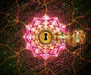
I had an idea to make the background a bit more than just a blurry thing, with some molten gold and stuff, and a pinch of magic. I hope it's the right direction. Also revised the ring decorations. I wasn't quite sure what you meant with the key glow, so just made a temporary stuff for it.
Personally I don't think it's quite ready yet, it's close but.. something's missing. But while I go back to being very busy, you could put your fixes and ideas on it, and I try to figure out what it is that's missing.
(The package includes one without a key and one with a black background.)
Attachments
Lookin' good, fellas.
All I can say is that I am most impressed and thoroughly delighted. What incredible eye candy. Kudos for your brilliantly creative efforts!!! :thumb_up:
Similar threads
- Replies
- 14
- Views
- 731