MooshyPeaches
Rising Star
AMAZING 10/10 loooove it

")
Enoon said:On my screen the layout of the forum is HUGE

Anthimus said:Layout looks nice, Trav, good job! Only thing I miss is the "Home" link for the thread sections. Will take some getting used to.
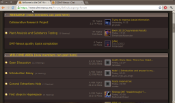
I have changed the layout a small bit. I have put the last poster and the datetime on the same line and now each subforum line is only 45 pixels high instead of 55 pixels.Enoon said:what a shock, lol. In general it looks real good and I like it. But one thing bothers me, and perhaps there is a solution.
On my screen the layout of the forum is HUGE and one subforum almsot fills the entire screen. It takes forever to scroll down to the bottom, which wasn't the case before. The font of the subforum name is much bigger than necessary IMO. In the attachment you can see what I mean.
granted I use a small netbook, so on regular screens it might be more user-friendly, but for me this is a bit annoying... I checked google chrome and firefox and both look the same, so I don't think it's a bug, but hey... I've been wrong before.
The banners are the exact same size as they were before, optical illusions for the win!universecannon said:my only quibbles are:
the banners do look a wee bit smaller
are there less topics listed in the active discussions? It was nice when there was a bit more (maybe the font is just tricking my eyes and it didn't change)