• Members of the previous forum can retrieve their temporary password here, (login and check your PM).

Mr. Peabody's Transcredible Fantastic Traveling Art Gallery Extravaganza!! (TM)

Migrated topic.
I'm trying to put these in chronological order. Also, there are some new ones making their Nexus debut! Not that they are recently made, just new to you. Maybe...
 

Attachments

  • Graced1.jpg
    Graced1.jpg
    619.8 KB · Views: 0
  • Create.jpg
    Create.jpg
    959.2 KB · Views: 0
  • Pull.jpg
    Pull.jpg
    748 KB · Views: 0
  • Absence.jpg
    Absence.jpg
    654 KB · Views: 0
  • Shadow.jpg
    Shadow.jpg
    1 MB · Views: 0
  • Free1-2.jpg
    Free1-2.jpg
    1.2 MB · Views: 0
  • unknown6.jpg
    unknown6.jpg
    1.3 MB · Views: 0
Here's some more comin at yo brains.
 

Attachments

  • Awake.jpg
    Awake.jpg
    688.8 KB · Views: 0
  • Killingsworth.jpg
    Killingsworth.jpg
    1.8 MB · Views: 0
  • Columbine.jpg
    Columbine.jpg
    542.2 KB · Views: 0
  • Spiral1.jpg
    Spiral1.jpg
    438.4 KB · Views: 0
  • MrPeabody_Elles.jpg
    MrPeabody_Elles.jpg
    416.6 KB · Views: 0
  • dark+matter2.jpg
    dark+matter2.jpg
    1,021 KB · Views: 0
Moar!!!
 

Attachments

  • In+Phase.jpg
    In+Phase.jpg
    1.2 MB · Views: 0
  • Energy.jpg
    Energy.jpg
    865.9 KB · Views: 0
  • Alt.jpg
    Alt.jpg
    834.3 KB · Views: 0
  • Rippled.jpg
    Rippled.jpg
    578.1 KB · Views: 0
  • Warm.jpg
    Warm.jpg
    1 MB · Views: 0
  • Spirit.jpg
    Spirit.jpg
    555 KB · Views: 0
Can you handle this?
 

Attachments

  • Lumin.jpg
    Lumin.jpg
    737.3 KB · Views: 0
  • MrPeabody_Did+this+really+happen.jpg
    MrPeabody_Did+this+really+happen.jpg
    228.6 KB · Views: 0
  • Maple.jpg
    Maple.jpg
    1.2 MB · Views: 0
  • See.jpg
    See.jpg
    440 KB · Views: 0
  • Hypersphere.jpg
    Hypersphere.jpg
    420.3 KB · Views: 0
  • Misty+Pond.jpg
    Misty+Pond.jpg
    964.9 KB · Views: 0
Thanks Adam! Practice is all it takes. Anyone can create art they're proud of with enough effort.

And now, here's MORE!!
 

Attachments

  • Blobby.jpg
    Blobby.jpg
    1.7 MB · Views: 0
  • MrPeabody_Well_Up.jpg
    MrPeabody_Well_Up.jpg
    1.3 MB · Views: 0
  • MrPeabody_Hyperspace1.jpg
    MrPeabody_Hyperspace1.jpg
    138.6 KB · Views: 0
  • MrPeabody_Crystalline.jpg
    MrPeabody_Crystalline.jpg
    139.1 KB · Views: 0
  • mandala3.jpg
    mandala3.jpg
    938.7 KB · Views: 0
I believe this is the last ones. If you want to see the most recent, click on page 1!

And, as always, there's plenty in the works. You must learn patience, young grasshopper.....
 

Attachments

  • Rosette.jpg
    Rosette.jpg
    1.5 MB · Views: 0
  • A+day+in+cyan.jpg
    A+day+in+cyan.jpg
    1.7 MB · Views: 0
  • MrPeabody_Torn+Away.jpg
    MrPeabody_Torn+Away.jpg
    1.4 MB · Views: 0
  • MrPeabody_String+Being.jpg
    MrPeabody_String+Being.jpg
    1.6 MB · Views: 0
  • MrPeabody_Drop.jpg
    MrPeabody_Drop.jpg
    758.1 KB · Views: 0
  • MrPeabody_Fell.jpg
    MrPeabody_Fell.jpg
    796.7 KB · Views: 0
  • MrPeabody_Tree.jpg
    MrPeabody_Tree.jpg
    1,010.5 KB · Views: 0
Wow.

Some beautiful work man! You create such great movement in all your pieces, I'm impressed. I really love some of them, especially the water drop looking one, and this second to last one. Great stuff!
 
Ok, one last post for now. I wanted to show back to back, my original ink sketch, and the final digital version of "Splash".

I wanted to contribute to Guyomech's digi tutorial, but I essentially only used what he outlined already. I'm sure I have my own little techniques individual to me, but as of yet I don't have anything really groundbreaking to share. Mostly, I want to just show what can be done, and that Guy's tutorials should be enough to get anyone going.

Edit:
Thanks Wax! I appreciate that very much.😁
 

Attachments

  • splash.jpg
    splash.jpg
    1.2 MB · Views: 0
  • splashf.jpg
    splashf.jpg
    292.5 KB · Views: 0
That flower with alien circuitry or whatever you want to call it is seriously awesome, I have been trying to draw trees with that same sort of circuitry. Anyways keep it up this stuff is really amazing. Hopefully one day I will be good enough to post something on here.8)
 
Yeah, that one was a tattoo design for another nexus member. It turned out to bee a bit too much for what was a smaller tattoo, so the end result was a bit different. I enjoyed working with someone to create that. It was a mix of their input and my creativity.

And don't be shy about posting some things up! We have some very talented artists here, as you no doubt have seen. They are more than willing to help you out if you want it, or just provide encouragement.
 
Wow, I had no idea it had been so long since I posted any images up. This last semester was a rough one, to be sure.

Here is a drawing I am doing as a present. The recipient likes skulls, so I figured I'd give a Mr. P style skull.

I guess I'm not done yet, but it's come out pretty nicely.

More to come!
 

Attachments

  • IMAG0629.jpg
    IMAG0629.jpg
    946.2 KB · Views: 0
Thanks a lot everyone!

I am not sure if this one will get any color. I think it should be ok without, given the nature of the subject.
 
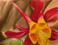
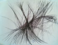
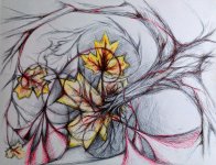
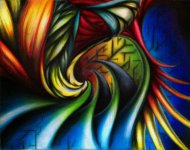
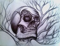
Sometimes muted, subdued colors can be fun. Ever try out the Prismacolor gray range? You can get some slightly warm and slightly cool tones without veering too far from the neutral. It can also be fun to stick almost entirely with neutrals but then introduce one vibrant color element, such as primary red.

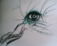
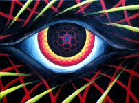
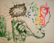
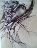
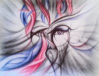
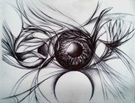
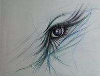
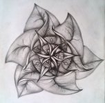
The skull is good, nice perspective. Doing a quick review of your older work, I'd say that anatomy is the most conspicuous thing- for example, a couple pieces featured eyes prominently- if the eye anatomy in those pieces had been as accurate as the skull is here, they would have been stronger pieces in general. In other words, thumbs-up in the attention to anatomical detail.

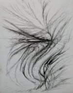
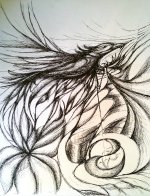
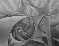
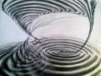
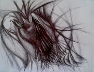
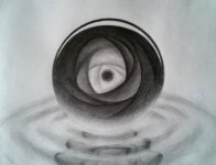
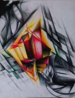
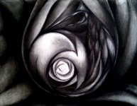
Another comment, as long as I'm dishing out the unsolicited advice. Some of your strongest work uses the full value range effectively, but not all your pieces do. In this one you've got your dark detailing and some very soft shading, but the mid-range values are underrepresented. Sometimes it's nice to sketch out your initial detailing in mid grays instead of blacks, then to build the whole thing up until you arrive at your darkest tones in just the right places. That makes for a much fuller, deeper look. Also try looking at the piece from a distance every now and then as you are building the shading, which gives a better sense of how the depth and volume reads.
 
I really appreciate the unsolicited advice! Keep it coming!

I hadn't even considered the grey scale pencils, but that sounds like exactly what I need. I'll definitely pick some up! I think they'll fit my style very well, and go especially well with pieces like the skull.

The advice about value range is spot on. I hadn't even noticed, and that's one of those things that is hard to pick out for oneself without any formal training. One of the things I run in to using ink pens is controlling the value, but ink lets my creativity flow better than pencil. I think its something to do with how I can't erase, so I don't dwell on mistakes, and I just keep going. It's good and its bad.

Thanks so much!
 
So, I thought I would reach out and ask for some of you talented folks' opinions.

This drawing is from a recent trip, my roughest trip (yet....). I think it's worthy of some color, but colors kind of confuse my poor noggin. So, does anyone have any advice? I could go for tips on a color scheme, or even just some good references on color theory. I was thinking of keeping it on a limited pallet colorwise, like maybe blue and green. I dunno....

Let me know what you think!
 

Attachments

  • Shredded.jpg
    Shredded.jpg
    1.5 MB · Views: 0
Back
Top Bottom