• Members of the previous forum can retrieve their temporary password here, (login and check your PM).

Nexus frontpage graphic collaboration project

Migrated topic.
really awsome 3d work guys!!

lots easier to imagine how it will come together now

the animation preview really makes me wonder why we dont have lots of lysergic cartoons to watch

i brought mine home from the studio to photograph and edit, just looking for a good cam to borrow as i only have a little digi cam

cant wait to see the first mockup
 
Those gears are really awesome! Ill try to figure out if theres some way of incorporating them, to the background or the structure .. And I have to agree with Nils, I don't think you should give up your panel, that GVG Ganesha is gonna be totally badass for it.
 
I wasn't proposing not using him - just making three more to flank the centerpiece in the outside four corners - in lieu of putting him in a panel. I think I could make them pretty consistent - two light deities and two dark, so to speak (not that I know my Hinduism). I was thinking of a dancing Shiva opposite Ganesha on top, and grotesque looking Yama and Kali in the bottom two corners.

...if you're all amenable, of course. I just think the perimeter might look a bit sparse with a lot of essentially unoccupied space. And if hyperspace is what we're shooting for, how much unoccupied space do you all actually encounter in there? Because for me, there ain't a lot. Might help accentuate the center lotus as well (and the overall perspective), as I can place an exaggerated light source for each as if it is coming directly from that source.

FYI - I did make a gvg last night and hung it out of his mouth a la Sherlock Holmes. Haven't decided if I like it yet, but I'll make it work somehow.
 
I'm still in favor of cropping out as much extra background as possible, to make the rest of the design larger... And fade the background out to black around the edges so it merges smoothly with the black screen around it.

This could still leave plenty of corner space, but I don't know that full figures of deities would fit these odd triangular spaces very well. Would need to either be just the right body positions, or a clever crop of each.

I think what Art is actually saying here is that he really wants a complex zBrush project to keep him up late every night for the next six weeks.
 
Guyomech said:
I'm still in favor of cropping out as much extra background as possible, to make the rest of the design larger... And fade the background out to black around the edges so it merges smoothly with the black screen around it.

I'm with this ^ ...although I like the twinkling stars....maybe a galaxy or two..!

I guess we should wait till Daeda finalizes the 3D and see what's left after the crop. The screens don't want to be overloaded by complex background..

@ Guy...your right ...it's tricky getting 3 colours to mix well.:cry:
 
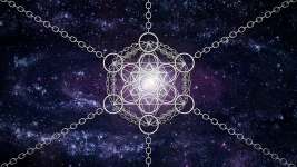
I've been running into some set backs as far as my modeling capabilities and inspiration go but here's what I have so far. Lots more to come but the learning process has been kinda slow going.

Edit: A quick update of the days work...
 

Attachments

  • Nexus-Rough-05.png
    Nexus-Rough-05.png
    831 KB · Views: 0
I really like where that's going, MelCat... Are you using a flat perspective on purpose? A tighter camera view might exaggerate the sense of perspective and bring out the dimensional qualities of your shape, which right now is amazing but looks just a little flat.

Some big DNA in the deep foreground would also add to the sense of dimensionality.

Looks very cosmic!
 
Thanks guys, I really appreciate the encouragement. All of your works are really amazing as well. I'm really looking forward to seeing where this is gonna end up.


Guyomech said:
I really like where that's going, MelCat... Are you using a flat perspective on purpose? A tighter camera view might exaggerate the sense of perspective and bring out the dimensional qualities of your shape, which right now is amazing but looks just a little flat.

Some big DNA in the deep foreground would also add to the sense of dimensionality.

Looks very cosmic!

I'm using the flat perspective right now just to make sure I've got everything lined up alright. I'll be trying out some different views and perspectives as I make more progress and add more elements to it.

I've been trying quite a few different things but nothing is turning out the way I envision it so far. Kinda like I've been trying to model some futuristic hyperspace chains but that has been a complete failure so far. I also made some shipibo patterns out of chains but that didn't really work that well either.

I've learned a lot so far but still have a long way to go...
 
Working in 3D definitely involves a lot of trial and error... I've made some fancy crystal shapes where almost all the work went in directions that didn't work out... Feels like a waste at the time, but it's a necessary part of the journey toward getting the results you're after. Don't get discouraged!
 
Great energy and space; beautiful.

So I've got and idea I'd like to run by you good folks.

We finish the art; Daeda (with possible help from others) finalizes it; Traveler installs it and it goes live;

We all (or as many as circumstances allow) get the thing up on our screens, agree on a time; have a Nexus front page SHE.

Thoughts?
 
D loops the page the way you have it now looks amazing, even with the blank spaces it looks very awesome and IMO much more modern and cool than the last one.

Im loving everyones drawings, i love the facescape tokapeli
 
I'm down for a front page SHE when the time comes. I'll probably go for some aya and shrooms as those have been calling to me the most lately.

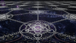
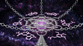
Here are a couple of updates that I've been working on.

The first is an attempt to go for an infinite pattern into oblivion but unfortunately my machine choked the further I got into the horizon. I might revisit the idea later and use a less complex model for the horizon once it starts losing detail.

The second image is some tweaking to the perspective and background. I also added some glowing pink molecules because I really dig the pink in the original frontpage and wanted to show some homage to it.
 

Attachments

  • Nexus-Rough-06c.png
    Nexus-Rough-06c.png
    874.2 KB · Views: 0
  • Nexus-Links-007c.png
    Nexus-Links-007c.png
    867.4 KB · Views: 0
Those both look awesome. I especially like the background in the second one. Love that pattern. But the infinite horizon speaks to me as well. Really cool.
 
Thanks Nils, I'll try again for the infinite horizon once I get all of the other small details I have in mind finished up so that the tiling is the last thing to do. That way it won't matter if my computer sputters a bit, it's just a matter of lining everything up and rendering it.

I'm loving all of your designs so far too. I'm really looking forward to seeing how it's coming along so far.
 
Back
Top Bottom