
-
Members of the previous forum can retrieve their temporary password here, (login and check your PM).
You are using an out of date browser. It may not display this or other websites correctly.
You should upgrade or use an alternative browser.
You should upgrade or use an alternative browser.
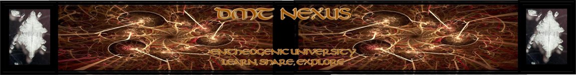
[WANTED] New forum Banners
- Thread starter The Traveler
- Start date
Migrated topic.
")
Why choose? They're all quite rockin'.
Looks good guys! Nice work!
Thanks all!
Also I have to join the rotating-banner club because all the other ones are really awesome too.

 But I'll try to upload them soon with a few other variations aswell.
Also I have to join the rotating-banner club because all the other ones are really awesome too.
Yes I did. And yes I love pink.onethousandk said:Great colors and icons. Did you make your avatar as well? Interesting style.
You mean the pink glow would be orange? Or the letters themselves would be orange? And the background is already blue but did you mean a lighter blue? I tried all of those choices but I can't look at them objectively because I'm so keen on the pink one now.alert said:nice daedaloops! I think it would look better with orange letters on a blue background but I dig the design!
But I'll try to upload them soon with a few other variations aswell.You mean increase it vertically? I could do that but I would have to do it by shortening the vine-bridge because I can't mess with the golden rectangle on the left. I'll see what I can do.kyrolima said:I love the one from daedaloops.
Altough you have to improve the size of it.
daedaloops, are you dadara ?
I don't think so, but I can't be sure.obliguhl said:daedaloops, are you dadara ?
Electric Kool-Aid
Explorer, Creative and Curious
Hyperspace fool - your images look a bit stretched! Cant see details.
Looks better at full resolution... the image display here is showing it at something like 25%.Electric Kool-Aid said:Hyperspace fool - your images look a bit stretched! Cant see details.
Perhaps this attempt shows that a simpler lower res design might be better for this purpose.
I did a bit of editing to make it sharper when shrunk down and bring out the colors more... hopefully it helps. I think instead of editing this one further, though, I would be better served to make a new one. (Perhaps a higher DPI and lower overall resolution if I can manage that...)
Attachments
Electric Kool-Aid
Explorer, Creative and Curious
Yup! Great work guys!!! Fan'flippin'tastic!!!
Hyperspace Fool said:I did a bit of editing to make it sharper when shrunk down and bring out the colors more... hopefully it helps. I think instead of editing this one further, though, I would be better served to make a new one. (Perhaps a higher DPI and lower overall resolution if I can manage that...)
I love the look but I think it needs more work. The graphic is stunning. Perhaps it should span the entire banner, I know that would be difficult without distortion. If you could get that fractal to span the entire banner width it would be just perfect.
spaceshuttle
Rising Star

autodidactus
Rising Star
i think the same way as with photoshop, either go to the control panel and go to fonts and add it that way or just go to the c:/program files/windows and i think the fonts folder is in there.Space said:Anyone using Corel here? How do I upload the nexus font into it?
i know you guys said we don't need that android jones guy and whatever and i agree but i wanna see what the guy who made this would come up with. found it while searching dmt on deviantart a few weeks ago

Similar threads
- Replies
- 17
- Views
- 615
- Replies
- 2
- Views
- 171
- Replies
- 2
- Views
- 160