
-
Members of the previous forum can retrieve their temporary password here, (login and check your PM).
You are using an out of date browser. It may not display this or other websites correctly.
You should upgrade or use an alternative browser.
You should upgrade or use an alternative browser.
Art Bin
- Thread starter SpireCatalyst
- Start date
Migrated topic.
You are right, he really should...anon_003 said:But seriously Mr. Peabody you should start a new thread and just post all of those black and whites. They are quite gorgeous!
")

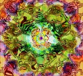
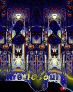
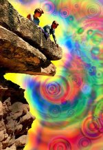
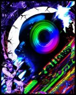
Recent cs6 stuff I've created. Photoshop is my new addiction. I have a long way to go, but I'm so grateful that I found something that silences my mind
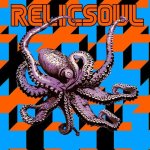
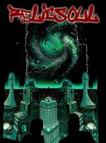
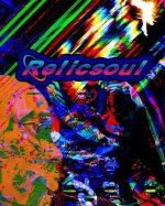
Btw relicsoul is a what I my artistic alter ego
Btw relicsoul is a what I my artistic alter ego
Attachments


Raytracer, those are great... Nice iconic pop feel to it but still very psychedelic. If you want a gallery at www.dmt-nexus.me/art please PM me.
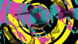
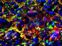
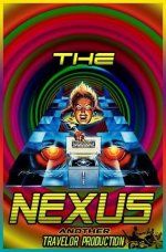
Thank you Guyomech. I've been really getting into creating these things. I can't wait to get my Internet up again so I can check out tutorials etc. I have a lot to learn, but I'm confident one day ill get there. I have a pretty lousy monitor, so I'm always curious how they look on other people's computers. Any tips, advice, constructive criticism etc would be awesome. So many creative folks on the Nexus. Here are a few I made last night. I misspelled traveler on one of the posters.
Attachments

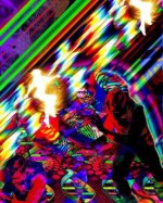


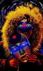
Thanks Wax most of the characters are found on fffound! and tumblr. I like making patterns and stamps then using various blend modes etc. I love using gradiants with the Difference blend mode and the layer styles are also very useful. I've found that layer styles can be used in so many ways. Drop shadows, outward glow etc can be used to create effects other than what they were supposedly intended for . Masking takes the most time: practicing S curves more recently as well as hue and saturation.
I also makes beats using samplers and synths. This type of thing is so similiar. Just like I only use rare grooves, psa's, commercials etc. for samples. i always chop the images/samples up beyond recognition. In this case it's old pulp magazine covers, golden age comics, pinball machine art. it's fun breathing life into faded and forgotten illustrations from the past. looking forward to getting a scanner so that I can scan old natgeos and other old illustration and photos. The photos I'm manipulating are crappy 72ppi Jpegs. Things will look much better once I start using higher resolution images.
Anyone out there with advice on using the pen tool? I need to master that and the curves adjustment. To members like Cyb and Guyomech , could u reccomend any good sites with tutorials? I really want to learn more about image adjustments...using the dodge and burn tools correctly etc. I'm completely self taught and I wonder sometimes if I'm doing stuff correctly. Guyomech is the first person to offer encouraging words other than my wife. My family refuse to offer any encouragement . Never a like or a comment when I upload pics on fb. I guess some people think art is something that you buy at k mart and hang in your living room Sorry for the long winded message. Thanks for the kind words
most of the characters are found on fffound! and tumblr. I like making patterns and stamps then using various blend modes etc. I love using gradiants with the Difference blend mode and the layer styles are also very useful. I've found that layer styles can be used in so many ways. Drop shadows, outward glow etc can be used to create effects other than what they were supposedly intended for . Masking takes the most time: practicing S curves more recently as well as hue and saturation. I also makes beats using samplers and synths. This type of thing is so similiar. Just like I only use rare grooves, psa's, commercials etc. for samples. i always chop the images/samples up beyond recognition. In this case it's old pulp magazine covers, golden age comics, pinball machine art. it's fun breathing life into faded and forgotten illustrations from the past. looking forward to getting a scanner so that I can scan old natgeos and other old illustration and photos. The photos I'm manipulating are crappy 72ppi Jpegs. Things will look much better once I start using higher resolution images.
Anyone out there with advice on using the pen tool? I need to master that and the curves adjustment. To members like Cyb and Guyomech , could u reccomend any good sites with tutorials? I really want to learn more about image adjustments...using the dodge and burn tools correctly etc. I'm completely self taught and I wonder sometimes if I'm doing stuff correctly. Guyomech is the first person to offer encouraging words other than my wife. My family refuse to offer any encouragement . Never a like or a comment when I upload pics on fb. I guess some people think art is something that you buy at k mart and hang in your living room
Sorry for the long winded message. Thanks for the kind words")

Blotto, that's fantastic; have I invited you yet to be part of the Nexus member art gallery?
RayTracer, I'm totally self taught. My wife is a fairly hardcore photoshop user so we share our discoveries over the dinner table, which is helpful.
The pen tool is really essential. Most of it is just getting the hang of it. Keep your history palette open and if anything happens to your path that you can't seem to fix, just step back as many steps as you need to. Play with keys: command allows you to drag around and edit control points. Control allows you to change them from curved to corner and back. Also play with your Paths menu, see what it offers.
Keep making the great art, and those around you will eventually stop doubting it.
Hey RayTracer
There are a million tutorial sites available and they are all pretty good. Photoshop is almost infinitely variable and there are a hundred ways to do one thing.
Type 'Best Photoshop Tutorials' into Google and you will get the latest and best around.
Also the dedicated magazines are amazing.
As Guy says the Pen/Brush Tool is really cool...if you have a pressure/tilt pen and tablet, (such as the Intuos 4) it can be extremely versatile. Many settings to control the angle of tilt how the pressure is used can be found in the Brush/Brush Preset dialog box.
Curves is like an overblown exposure setting and can be very harsh on the brightness and contrast of an image. It can be used wildly (inc separate RGB channels) to create trippy color madness or very subtly to boost shadows and clip overexposed areas.
Dodge and Burn stem back to the days of real film photo development. Where you could hold back light from the projector with your hand or 'overexpose' certain areas of the paper by blocking the light and allowing light to fall on a certain spot.
Dodge and Burn should be used sparingly and built up over several passes. Set your Shadows/Midtones/Hightlights Range right down to say 9-14% and use a soft round brush to sweep in shadows that werent there or to pull back burnt out hightlight areas. The tools can be very strong if the range is set too high.
Great for creating depth to an image (shadows in the right places) or giving a flat object a 3D look.
Creating real 3D depth in a 2D image is an art in itself. Remember that things that are far away will appear faded and more opaque with less hue/saturation.
Mid ground objects are usually the place of focus so should be crisp and sharp.
Things that are real close appear punchy and a little blurred (if very close), so you can use various blurs on lassooed areas to create the illusion that is close.
Alien Skin Bokeh...is an Amazing plugin for this effect.
So many things can be tweaked with so many tools and functions but a good rule is
'Be Subtle' use small increments instead of large and they won't look false.
I trained as a Pro Photographer and honed PShop Skills as a Desk Top Publisher. These studies where invaluable...but PShop is a constant learning experience...it never ends.
Keep messing around and pushing buttons to see what they do...Set 30 levels of History in the preferences and you can never go wrong.
Your stuff is looking great :thumb_up:
cyb
anon_003 said:Here are a few ive just recently been working on.
You should post that here: Draw me a design and I would be honored to put it on my body forever - Music/Art/Literature - Welcome to the DMT-Nexus


Similar threads
- Replies
- 11
- Views
- 452
- Replies
- 14
- Views
- 674