• Members of the previous forum can retrieve their temporary password here, (login and check your PM).

Nexus frontpage graphic collaboration project

Migrated topic.
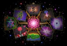
Allright, so while we wait for friday I thought now would be a good time to get some feedback on the overall design. I quickly added some color to Tokapellis drawing so it wouldn't just be a white stuff. So any critiques and suggestions are welcome, now it's time to polish and finalize this sucka.. And here is a link to a preview site with the animations and stuff: Welcome to the DMT-Nexus

I talked with the Traveler a few days ago and as you can see 4 of the links changed:
* FUN -> ART (member art galleries, currently being built)
* FAQ -> RESEARCH (new section)
* FILES -> LEARN (new section with the exams and stuff)
* LINKS -> CONTACT
This was my bad because initially I was so excited to start the project that I forgot to ask Trav if the links need to change. But luckily the artwork don't need to be changed since they still happen to fit the new keywords pretty nicely. Also, as there won't be a FUN-section anymore, the collab project for that is now cancelled. Sorry for anyone who was expecting it. But maybe in the future there will be some sort of fun-section, who knows.

As for Tokapelli, I really hope he's ok, he hasn't logged in since 5 days. But if he doesn't report in before friday, I suggest that we then collaborate on his facescape idea as I think it was really cool and fitting. I don't like the idea of someone doing 2 panels as the point of this was to bring out 8 different nexian personalities together. So I dunno is it breaking some sort of art code if we take his idea and just color it without his permission? I really hope he comes through but gotta prepare for the worst case..
 

Attachments

  • front.jpg
    front.jpg
    494.6 KB · Views: 0
Amazing work!! I'm so proud to have been able to be a part of this!

The only suggestion I have is to maybe swap cyb and Nils panels so that the brown and purple kinda alternate a little instead of being side by side as they are now.

As for Tokapelli, I suggest that we use his art as a placeholder for now and when he submits his piece, we can just update the panel with his work.

If he's no longer interested in doing the project, then we work on something together. It would be kinda cool for the wisdom panel to be a true collaboration between all of the artists somehow since our wisdom is of a collective nature anyway.

Just throwing around some ideas.. Great work everyone!!
 
Daedaloops, that animated piece is fantastic.

Can I make one suggestion/request? The frames you built around each panel are amazing. Is it possible to make those rotate like a chain around each image? If each one rotated left, then right, then left, etc., I think it would make the whole piece look even more alive.

Sensational work. You are the man with the plan.
 
Melcat and Art...Great suggestions :thumb_up:

Little tweaks on the levels...

Other than that...just...

-SPEECHLESS-

:love:

edit: Also wondering if the Red of the DMT-Nexus is a little lost. Maybe towards the orange/yellow hue for punch?
 
THAT... LOOKS... GREAT!


Fantastic work from all you artist and wonderful to see how deadaloops made this into the front page.

The only thing that I think that might be an improvement is if the center animation can be slowed down quite a bit, since now it continuously grabs all the attention of the page.

Let me know when I can install it. :)


Kind regards,

The Traveler
 
Seeing the pieces come together you could see was gonna be amazing but still exceeded my expectations, A job well done looks incredible.
 
That Looks Totally Amazinnng!

Im proud to have been a part of this project, and re-energised to see it in the last stages

Im going to take a high-rez shot of mine this week and tweak the colours a bit

the animation looks top notch, especially the pulsing colours on the patters

😁 😁 😁
 
Ka-Bang! I don't think I've ever seen such a psychedelic web page design, anywhere.

I agree with Cyb about normalizing the levels. Mine looks a little dull, as does Nils piece. Easy fix though.

Also like Art's suggestion about rotating frames... How much more load time might this entail? As it is it's a surprisingly quick load, even out here in the boonies.

And the lettering I think needs to be more prominent... Maybe a touch bigger, with a pulsating color-cycling glow?
 
Wow, you all have created a collaborative piece which is breathtakingly beautiful... It is an incredibly difficult thing to do with artists that have varying techniques and you have all managed to pull it off with great finesse and style, much respect.


Much Peace and Respect
 
Thank you! All I can say from my perspective is that it's been an honor to collaborate with such visionaries..

Made all the changes that I was able to for now, they were:
- flower speed to 50%
- adjusted levels (the thing with "art" and "learn" is that they are farther from lightsource)
- increased text size
- added color cycling to text

(press F5 on the site to update)

And like I already mentioned to Art , the animating frames would look really cool but that would be complicated right now with the way I built the scene and also I can't figure out how the cornerstones would change direction without clipping other stones. Maybe later when I have more time.

And about switching cyb's and Nils' panel, I tried that before but it throws off the balance because if Nils' panel is closer to the lightsource it becomes really white. I can render a comparison tomorrow but to me it didn't look right at all.
 
Looks fantastic! Great work everyone. I'm really happy I was able to be part of this project. :love:

I didn't catch the first iteration, but the movement in the center is still where my eyes wants to stay. I think it could be slowed down even more. Still, brilliant work daeda, you've done an incredible job bringing all of this together.

As far as Toka's panel goes, assuming he doesn't submit I think we should still use his idea. I think it fits the panel really well. I guess it would just be a matter of figuring out how we handle the execution.
 
I have cycled the background colour on my Panel to see if it makes a difference...have a look...
It maybe too many shades of blue on one side of the page though.
Uploaded here:
and a viewing small version
 

Attachments

  • FAQv2edit+Re+Colour.rar
    2.8 MB · Views: 0
  • FAQv2edit+Re+Colour.png
    FAQv2edit+Re+Colour.png
    581.2 KB · Views: 0
The Traveler said:
Error does not seem to work right now?
Yeah it's just a crappy free webhost, I'm surprised it lasted even that long with all the people clicking it.. I'll try to find another place to upload it to..
 
Back
Top Bottom