Art- there's so many things that have gone right with this piece... What aspect aren't you feeling? Or is it just not matching the picture in your head?
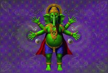
I do think the gold jewelry is a little too orange, and a bit satiny in finish... Can you add more of a metallic gloss? And a lime green specular halo might be all it needs to balance out the orange.
Glad you kept the pimp jewelry!
His overall look is kind of monumental. My only real concern is that once this is reduced, the facial features might be a bit small. You may want to play around with the size of the head-possibly just in Photoshop-and see if it's possible to push that at all without it starting to look cartoony.
I think the background is really cool (and very uniquely you)... The half-contrast repeated mandalas are a great touch.
The Art-glyphs in the background, along with the fine radial lines in the mandalas, may be too small to translate well once everything is reduced.
MelCat, I haven't had a chance yet to tell you how freaking cool I think your design is! Don't have a favorite version... The molecules are a striking touch with strong visual rhythm... The top one has more of a zen quality to it.
Would love to see what a wide angle lens would do to this (I do most of my rendering in wide angle). I like how it exaggerates the depth of things.
The infinite horizon is breathtaking. Not sure if it's the best approach for the tiny little space we are each working with here...


")