daedaloops said:talk about dpi when they could just talk about the pixel resolution which makes alot more sense.
You say ppi, I say dpi.. (sings) 'let's call the whole thing off...' :lol:

daedaloops said:talk about dpi when they could just talk about the pixel resolution which makes alot more sense.
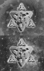
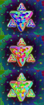
Guyomech said:I'm not sure if I'm done yet or not. Have put so many hours into it that I'm no longer sure if it's any damn good or not. So here are three versions, and I'd like some honest feedback.
To me it seems that the third is the best. Since the symbol is clearly in front of the background, giving it a more 3D aspect and some mystic ideas to me (the deep background).Guyomech said:I'm not sure if I'm done yet or not. Have put so many hours into it that I'm no longer sure if it's any damn good or not. So here are three versions, and I'd like some honest feedback.
Nils said:Guyomech said:I'm not sure if I'm done yet or not. Have put so many hours into it that I'm no longer sure if it's any damn good or not. So here are three versions, and I'd like some honest feedback.
Man, that's a tough call. My first instinct is to say that the second one is my favorite because of the pop you get on the shape when the background is deemphasized a bit (third one loses too much of the background imho). At the same time, I agree with Art's comment that the first one has a very unique flavor to it that none of our other pieces have. Maybe if the background was darkened a bit, you could get the foreground pop but keep all of the interesting shapes behind it. I guess what I'm looking for in the first one is more contrast. You can really tell the difference if you convert the image to b&w. The first image is mostly midtones.
")
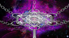
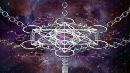
MelCat said:Here's the latest incarnation zoomed out a little and with a different background. Let me know if I changed too much with the background.
Guyomech said:Feedback anyone?
if you held a gun to my head, I'd save my life with door No.1 
 Hopefully one day art collaborations can be made via telepathy..
 ")