
-
Members of the previous forum can retrieve their temporary password here, (login and check your PM).
You are using an out of date browser. It may not display this or other websites correctly.
You should upgrade or use an alternative browser.
You should upgrade or use an alternative browser.
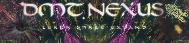
[WANTED] New forum Banners
- Thread starter The Traveler
- Start date
Migrated topic.
archaic_architect said:Melodic Catastrophe,
I'm not sure about the whole ratio thing, I made mine 1656w X 216h in points.
Also incase anyone isn't too familiar with web graphics you should set up your document at 72dpi and make a .png file when you go to post it up here, that will give you the best looking web graphic.
I love all the things everyone is coming up with! Theres a few that are tied up for my favorite right now, excited to see what else comes up")
I found this aspect ratio calculator
On my screen the main images show up as 963px wide and according to the calculator above, to get a 7.7:1 ratio the height would need to be 125px.
Does that sound about right Trav?
onethousandk
Rising Star
Melodic Catastrophe said:I'm kinda lame and I'm not quite sure how to achieve the 7,6666:1 aspect.
Are there some general dimensions in pixels that we could use as a guide?
A basic ratio would be 7.6 pixels by 1 pixel. Multiply as needed (766x100, 1533x200, etc).
onethousandk said:Melodic Catastrophe said:I'm kinda lame and I'm not quite sure how to achieve the 7,6666:1 aspect.
Are there some general dimensions in pixels that we could use as a guide?
A basic ratio would be 7.6 pixels by 1 pixel. Multiply as needed (766x100, 1533x200, etc).
Ahh, that makes a lot more sense. Thank you for spelling that out for me.
DoctorMantus
Hyperspace Architect/Doctor
I have fix my ratio should be a little better now.

Here is my PGN format as suggested. How come saving in PGN made the writing on the purple one look worse? The one below it though is fine.. Weird.
Traveller, if the purple version in PGN looks worse than the jpeg version I uploaded just stick to the jpeg.
Thanks!
Traveller, if the purple version in PGN looks worse than the jpeg version I uploaded just stick to the jpeg.
Thanks!
Attachments

autodidactus
Rising Star
updated the size ratio on mine. i liked the other one better but oh well. not to question your authority traveler but what is the importance of the 7.66666:1 ratio? wish i wouldn't have messed up in the first place and made it correctly.
also for anyone trying to fix the size ratio on theirs you can go to the rectangular marquee and for it's toolbar select fixed ratio and change it to 7.66666 for width and 1 for height.
hyperspacefool, it's supposed to be learn, share, expand, not learn, share, explore") . might i also suggest that you just use one fractal image and cut part it off and center it without stretching it.
. might i also suggest that you just use one fractal image and cut part it off and center it without stretching it.
also for anyone trying to fix the size ratio on theirs you can go to the rectangular marquee and for it's toolbar select fixed ratio and change it to 7.66666 for width and 1 for height.
hyperspacefool, it's supposed to be learn, share, expand, not learn, share, explore
. might i also suggest that you just use one fractal image and cut part it off and center it without stretching it.Attachments
autodidactus
Rising Star
or one of these 2 lol. whichever you like best. damn my indecisiveness haha
autodidactus
Rising Star
archaic_architect said:Space, check the dpi on it and make sure it is 72 .
If that doesn't fix it you may have to re do the typing make sure you don't stretch the font either use the points.
Will check it that out. Thanks!

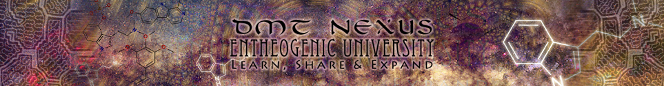
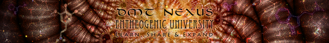
:dThe Traveler said:Can I remind the people to PLEASE use the 7,6666:1 aspect ratio.
Kind regards,
The Traveler
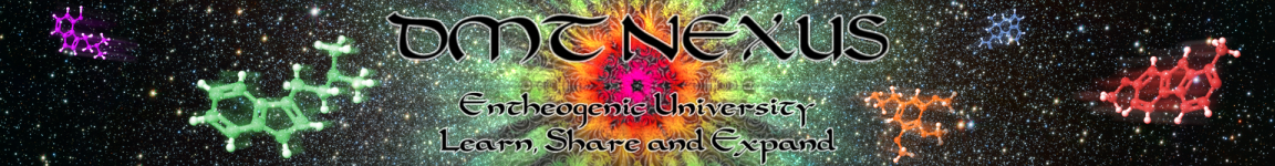
Wow Ash those are really cool. The green one is sooo vibrant, it's like its bloom fills the whole screen with warm green energy 
Melodic Catastrophe, the lower one is very nice. One of my favorites so far. It's a nice choice to change the font of the lower text indeed. :>
Melodic Catastrophe, the lower one is very nice. One of my favorites so far. It's a nice choice to change the font of the lower text indeed. :>
Smerrel said:Wow Ash those are really cool. The green one is sooo vibrant, it's like its bloom fills the whole screen with warm green energy
Melodic Catastrophe, the lower one is very nice. One of my favorites so far. It's a nice choice to change the font of the lower text indeed. :>
Thank you very much Smerrel!
Yours is definitely one of my favorites. I don't know I missed that you uploaded the psd to share. I loved how you did the text and effects for the logo. Awesome job!!
Similar threads
- Replies
- 17
- Views
- 637
- Replies
- 2
- Views
- 172
- Replies
- 2
- Views
- 161